Financial services redesign
Overview
Time
April 2019 Kickoff - February 2020 Launch
Brief
Conduct a redesign of an investment bank’s website to deliver a user centered design and organization of the content to achieve site objectives and business drivers.
Role
Contract UX Researcher and Designer on the MOJO agency team.
In Phase 1, I primarily worked alongside a Business Analyst who served as a consultant and researcher with an expertise in financial services. In Phase 2, I collaborated with copy, design, PR, and dev to bring the vision from the discovery phase to life.
Results
Redesigned the full web property including user-friendly site architecture, audience-focused navigation and copy, modernized design and a cohesive language and story to weave the company services together.
Created a contextual content engine to supply relevant content to site audiences. This is fed by an insights library of over 600 unique content pieces mapped by tagging to allow easy filtering by series, type, sector, industry and topic.
Collaborated with internal IT teams to build a robust web presence on the existing WordPress platform and associated Content Management system, allowing the marketing team to continue building and updating the site in a methodical way to support business demands.
Note: In 2023, a larger bank acquired the investment banking firm. While some elements of the digital presence have updated branding to reflect the new ownership, the majority of the site remains true to the structure and design initiated at launch.
Personal Developments
Gained deep insight on a new industry in financial services. Unlike a more transactional financial experience like banking or insurance, the investment banking world is highly focused on client service and relationship development. It is critical to show expertise through content and cutting edge research.
Managed the balance between internal stakeholder perceptions of business structure (ex. Internal team organization) vs. the external perceptions of how customers think about different services working together. We were ultimately designing a customer-focused website, so site content needed to reflect customer expectations vs. the way services are structured behind the scenes.
Developed efficiency using Sketch and collaborating on a “live” design document to embed representative copy and design elements through the process. Created a UX design system to be easily translated into high fidelity UI.
Process
Phase 1: Discover / Define
Stakeholder Interviews
To initiate the project, I conducted 17 stakeholder interviews with individuals representing different areas of the business. Most were focused on specific business units and industry-specific capabilities. Others, like the CEO and Chief of Staff brought visionary insights. In order to also gain insights for a key audience—prospective employees—I interviewed recruiters and conducted an insight gathering workshop with the current intern class to understand key differentiators for the organization.
Site Objectives and Audiences
Based on the interviews and the resulting themes, I developed the following site objectives to meet the needs of the site audiences.
Site Audiences
Prospective and Current Employees
Prospective and Current Clients
Press & Media
Investors
Site Objectives
Create Consistent Brand Story
Educate Prospective Employees
Move Prospective Clients to Contact
Support Brand Awareness
Service Existing Clients Efficiently
Big Picture Recommendation
In order to meet the site objectives, I recommended a content-driven redesign of the existing property. By creating a sophisticated content library, capability and industry pages are able to be supported with the most contextual content available. With a matrix-style organization, it was critical for users to see content related to both the capability they were viewing along with the industry focuses that were most relevant for them and the business.
To build on the content foundation, a simplified navigation was recommended to guide audiences with different levels of expertise (prospective employee vs. existing client) to the information appropriate for them. Given that the internal team would require the ability to grow the content library and scale the site as the business demanded, I recommended an easy-to-use CMS and dynamic, module-based templates for the site’s key pages.
To support these recommendations, an initial sitemap proposal and conceptual templates were provided.
Phase 1 Proposed Sitemap
Phase 1 Proposed Templates
Phase 2: Design / Develop
In Phase 2, I collaborated closely with the copy, design, and dev members of the team to bring the recommendations to life. We also had regular touchpoints with our client lead, getting input along the way.
Phase 2 Sitemap, including template specification for each screen.
Phase 2 Sitemap, continued. Includes detailed “Capabilities” section.
Audience-based user journeys highlighting primary and secondary paths through the redesigned site.
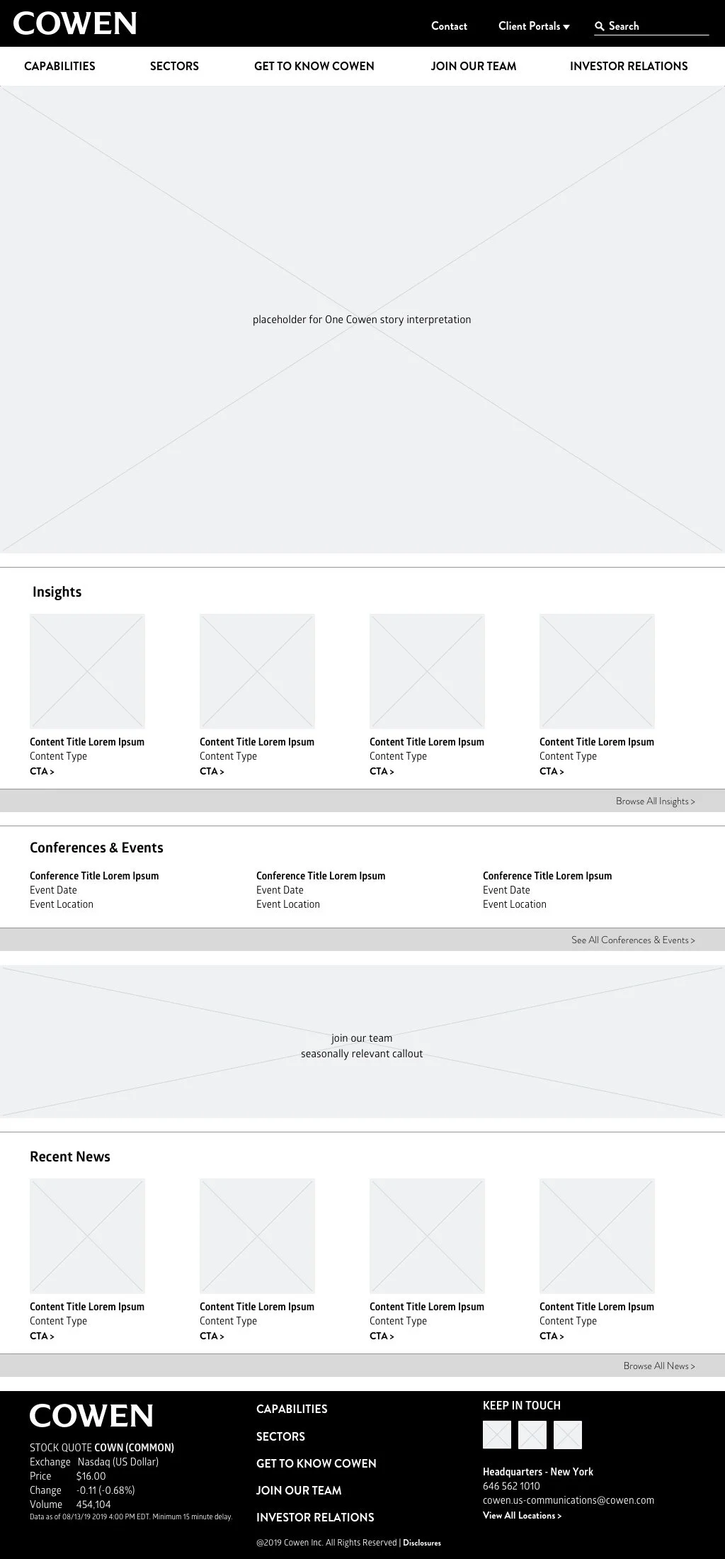
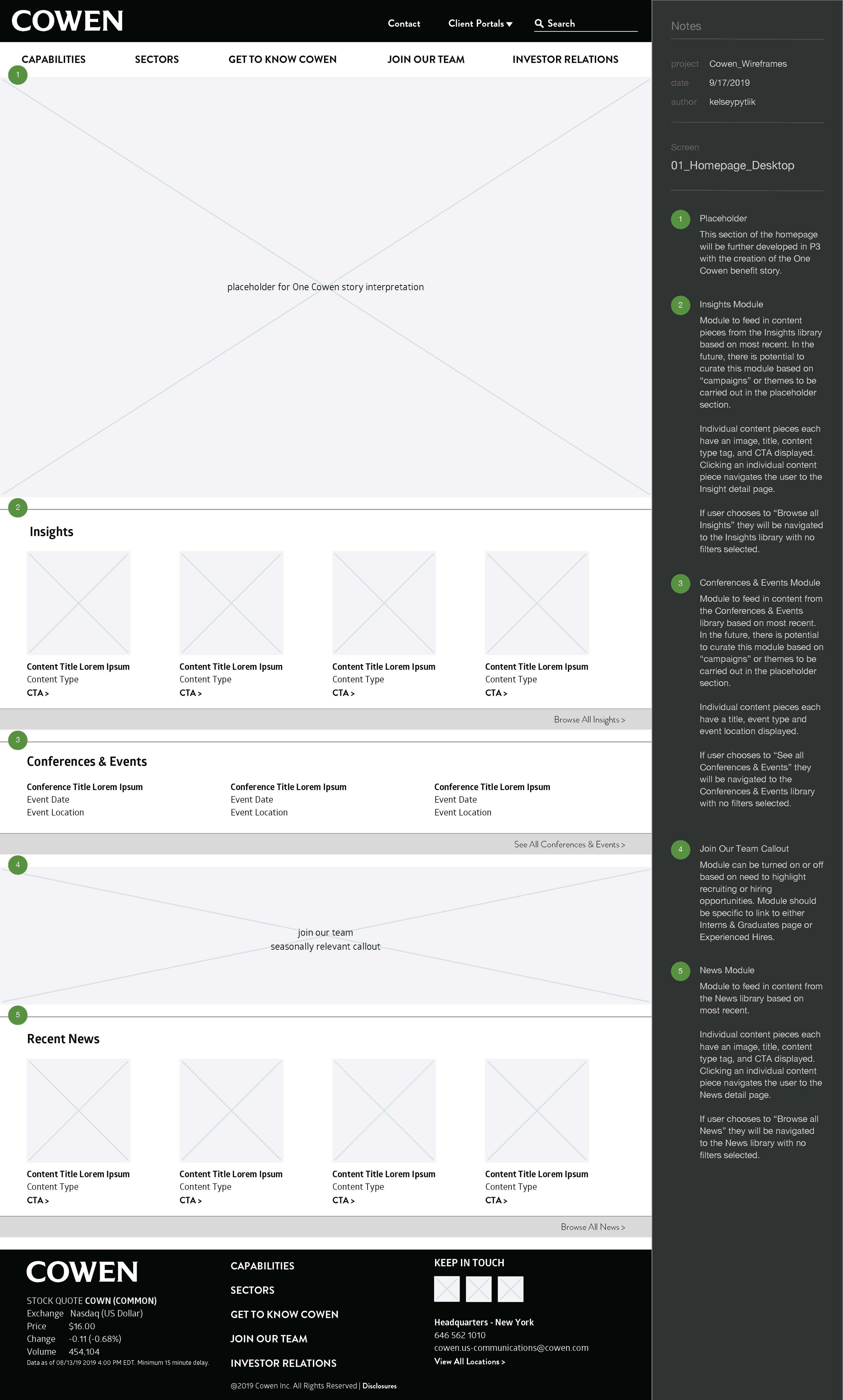
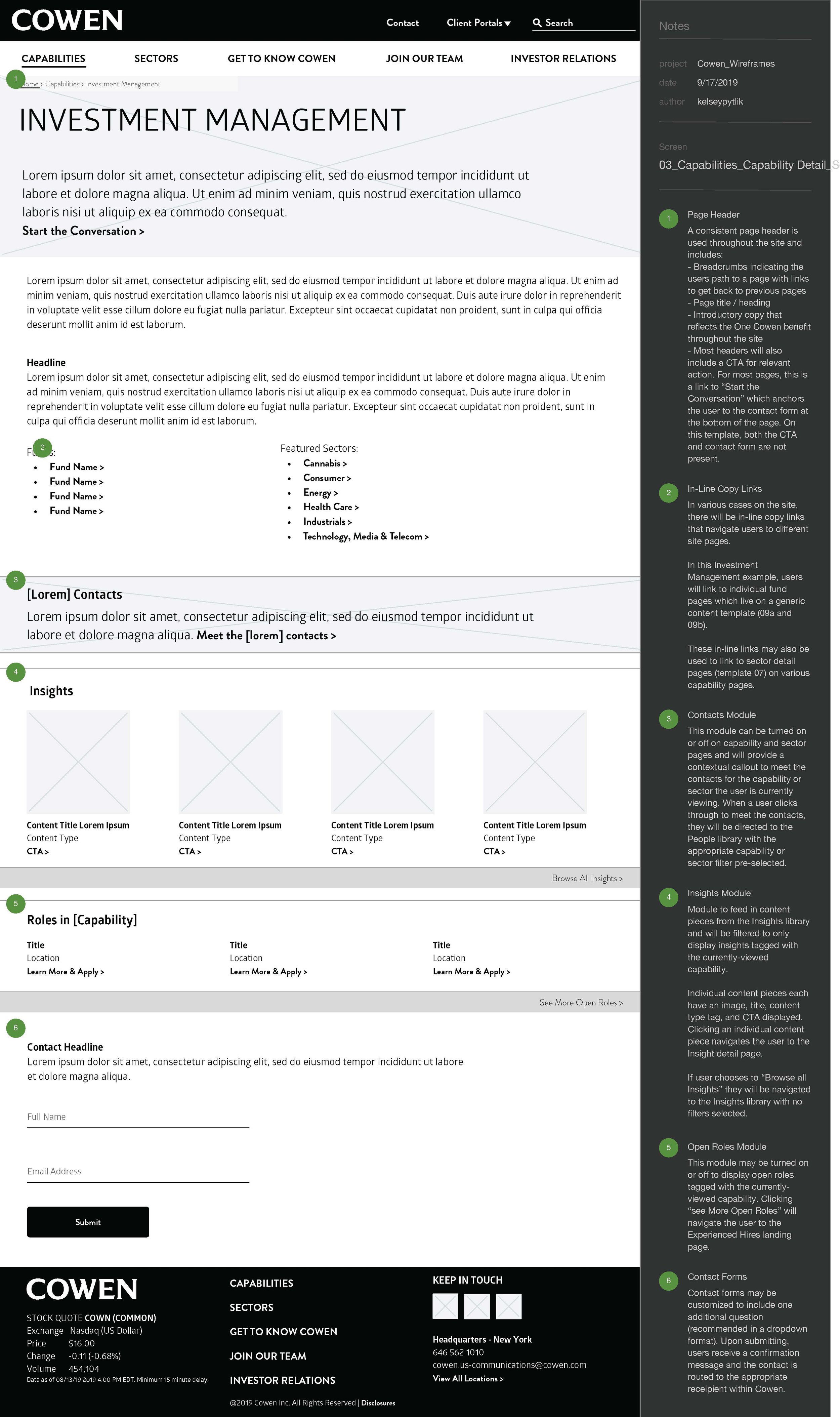
Recognizing the need to bring stakeholders along through the process, I opted for medium fidelity wireframes which would allow stakeholders to visualize their content within the templates, while not getting bogged down in exact design details. Following the development of wireframes, we returned to all of the stakeholders from the initial interviews in order to share the vision for the redesign and validate the direction.
Homepage
Capability Screen - Second Level
Content Library Landing with Filters
Given the level of fidelity in the wireframes, the transition to final design and copy moved smoothly, with a large amount of creative focus on telling the brand story and weaving it through the entire site to pay service to the integrated nature of the business. In this portion of the project, I served as a strategic voice and the voice of the stakeholders within our internal brainstorm and development.
Design Concept


